Tech Stuff Tales from the trenches
Drawing Rings With Css
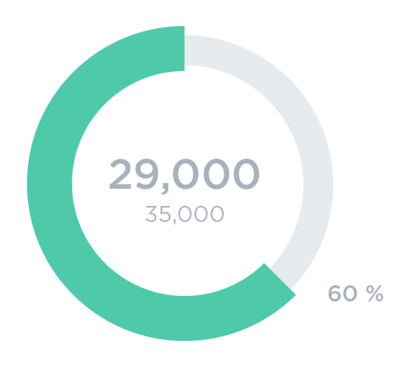
I mentioned in my last post that the main application I work on has just undergone a redesign. One part of this was adding more visual goodness to the dashboard which greets users on login and serves as their information overview hub. A new component here displayed a progress wheel to keep the user up to date with their target for the month. Here's the finished article...
So how to render this... let's pretend you didn't read the title of this post, and I'll tell you the first thing I considered was to use SVG. But I don't really know anything about SVG... so as well as having to start from scratch from an implementation point of view I've also no idea about the trade-offs of deploying it. So I thought I'd try using CSS.
Design Plan
The basic plan I had was to draw two rings, the green one placed infront of the grey one. I hoped that I could use percentage sizes inside a container to allow the whole thing to flex and move with the page.
The Easy Way...
The easiest part is obviously the backing grey ring so I won't spend too much time on that. Essentially it's two divs, styled to be circles, the back one grey and the front one white to overlay the middle part and give the illusion of the grey being a ring. Like so...
<div class="progress">
    <div class="back"></div>
    <div class="back-centre"></div>
</div>
.progress .back {
position: absolute;
background-color: #e7eeeb;
width: calc(100% - 10px);
height: calc(100% - 10px);
top: 5px;
left: 5px;
border-radius: 50%;
}
.progress .back-centre {
position: absolute;
background-color: #fff;
width: calc(100% - 40px);
height: calc(100% - 40px);
top: 20px;
left: 20px;
border-radius: 50%;
}As you can see from the code above I'm not worrying too much about backwards compatibility here, I'm lucky enough to be in the position where we can expect a modern browser. It's fairly self explanatory so I won't go through it. The only thing to note is the offsets and calcs which make the circle slightly inset (which will become important when drawing the green portion as it's a wider ring that overlaps on both sides).
The Hard Way!
That's the easy part done, but the green ring is tricker as it's partial. The plan for this part is to draw it in four segments by skewing a div around the origin of the circle, and then cutting out the middle with another overlayed circle. Maybe a disgram will explain...
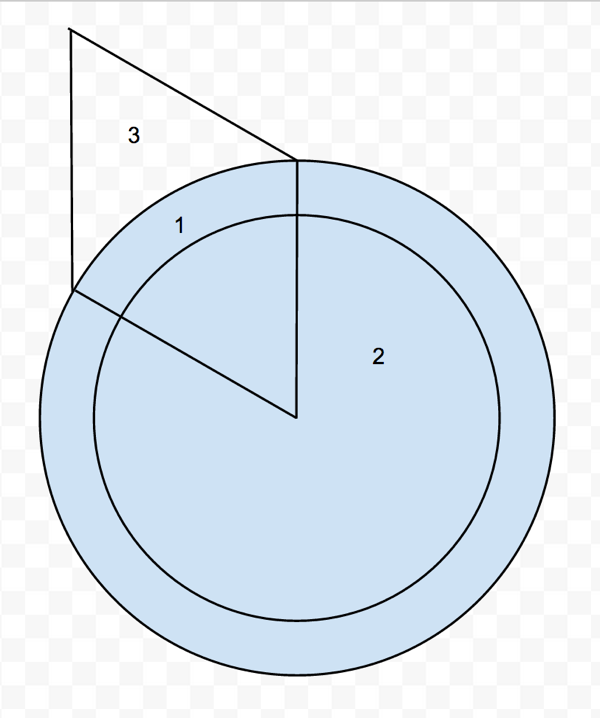
Going through the bits...
- The containing circle will hide the overflow
- The white circle will cut the centre out
- The green coloured skewed div will provide the appearance of the ring
Here's the code for the first segment, 0-25%.
<div class="seg seg-1" style="transform: skew(0deg, 45deg)"></div>.seg {
position: absolute;
background-color: #4ecaab;
width: calc(100% / 2);
height: calc(100% / 2);
}
.seg-1 {
top: 0;
left: 0;
transform-origin: bottom right;
}The transform uses a skew to achieve the rotation effect, the important part to note here for the first segment is transform-origin which specifies the corner of the div that the skew will be based on. The plan for the next three segments will be to move the transform-origin for each to be the centre of the circle...
.seg-2 {
    top: calc(100% / 2);
    left: 0;
    transform-origin: top right;
}

.seg-3 {
    top: calc(100% / 2);
    left: calc(100% / 2);
    transform-origin: top left;
}

.seg-4 {
    top: 0;
    left: calc(100% / 2);
    transform-origin: bottom left;
}
As I said I use a little templating server-side to decide which segments to draw and what angle to draw, here's the first segment...
{% if percentage <= 25 %}
    {% set angle = (percentage / 25) * 90 %}
    {% set skew = 90 - angle %}

    <div class="seg seg-1" style="transform: skew(0deg, {{ skew }}deg);"></div>
{% elseif etc... %}
The Final Result
The completed thing looks great, and resizes really nicely with the page. Obviously if you don't have a modern browser then you're going to see an absolute mess, but that's ok for my case.
As I mentioned at the start of the article I didn't choose to use SVG because of my complete lack of knowledge of it - but I'm really pleased with how it came out with CSS. If I've missed some tricks and there are actually much simpler ways to do this then I'd love to hear about it so leave a comment.